Neve Learning Platform, redesigning navigation journey
Product Design
Project Duration
1 Month
About the project
Neve Learning is an EdTech platform helping organisations deliver training and courses online. I led product design from MVP through to launch, running accessibility research, redesigning core navigation and unifying the visual experience across the platform to make it more intuitive for learners and trainers alike.

Who for
Neve Learning is a digital learning platform designed to support neurodivergent learners for workplace trainig
My Role
Lead UX Designer, focusing on translating user needs into tangible and impactful products
Collaboration
I worked closely with neurodivergent users to identify key focus areas especially within the context of workplace training, shaping a clear direction for the design. I also collaborated with developers and stakeholders to deliver the final product.
The Problem
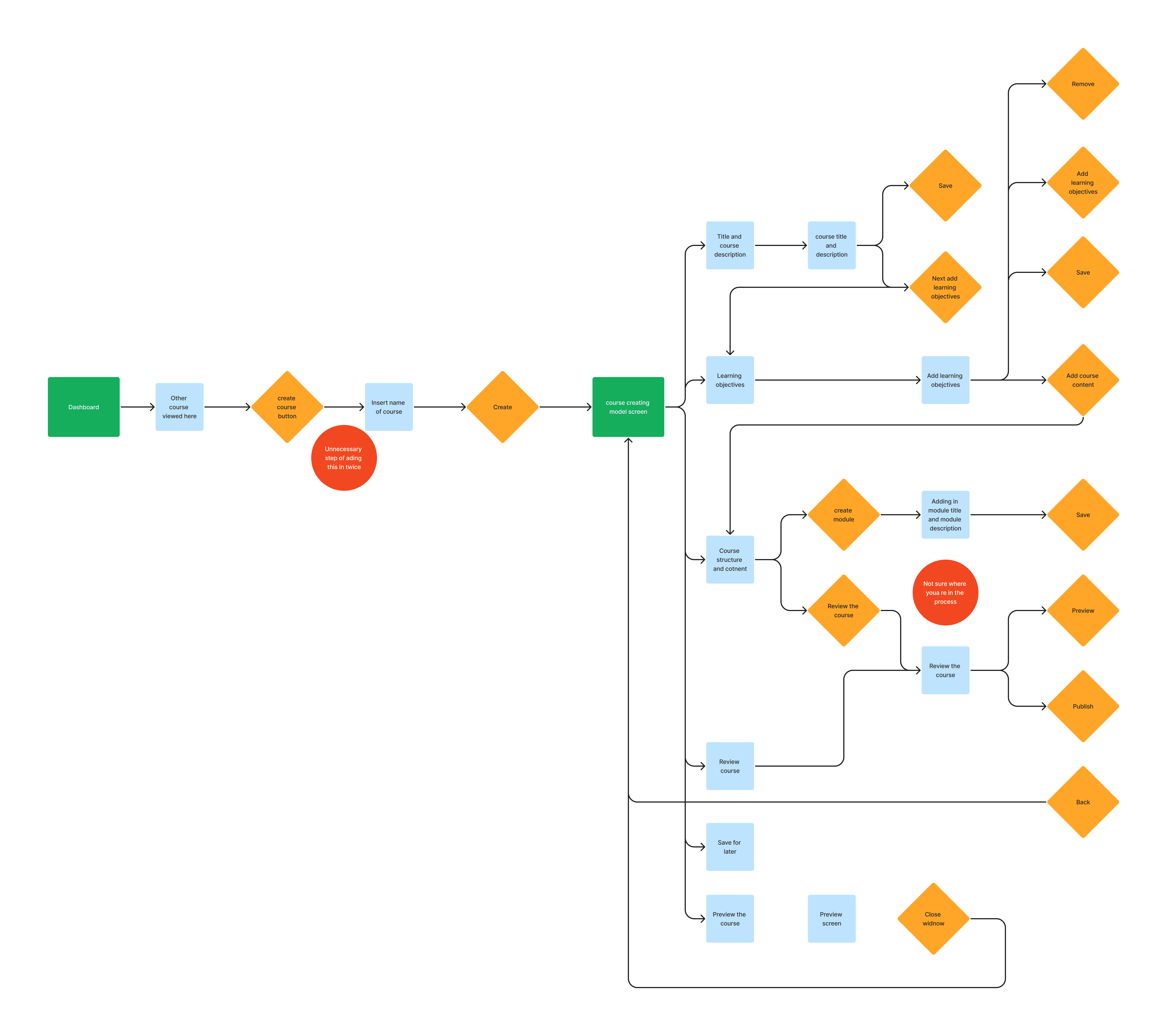
Learners struggled to move through courses and understand where they were in their journey. The experience felt disjointed, with content spread across multiple screens and limited flexibility to revisit or navigate between sections. For course creators, building content was equally fragmented, with a step by step process that lacked clarity and made it difficult to manage and structure learning effectively.
Discovery
Process & Approach
Research session
The project started by clearly understanding where real users were struggling. I worked with a neurodivergent user with Dyslexia and ADHD, asking them to complete tasks on the platform while observing how they navigated it.
This gave clear insight into how they interacted with the experience. The user struggled to find and reference key information from related activities, which caused confusion and made them feel lost.
Another key issue was understanding where they were in the journey and how many activities remained. Not knowing this created uncertainty, which led to feelings of overwhelm, especially within a work environment.

Define
Key issues
Confusing journey
No clear indication of where users are in their learning journey. Users felt they were feeling lost in their journey. Especially when they had to reference back to previous activities for referencing. This led to a confusing flow of going back and forth to complete the activites
No clear mental modal
Users lacked visibility into course duration while actively learning, which posed a risk to completion rates. Without a clear sense of progress or end point, users were more likely to disengage and drop out.
Disconnect in the branding
Over time, the learning experience had drifted from the platform's brand identity. Once users entered a course, the interface felt noticeably disconnected, as though they had moved to an entirely different product.

Develop
Design iterattion
Feedback on Activity tabs redesign
I first focused on the activity tabs, we looked at other LMS platforms and UI components that showcase menu options for the user. At first, we created a shortened activity menu items that could be scrolled through horizontally
WCAG Standards
We designed the new screens in line with WCAG standards to ensure the platform was accessible to edge users from the ground up. This shaped decisions around colour contrast, type sizing and navigational clarity across the experience. We then went back to real users and tested the new designs with them directly, including learners with dyslexia and vision impairments, to make sure the changes held up in practice and not just in principle.

Delivery
Solutions
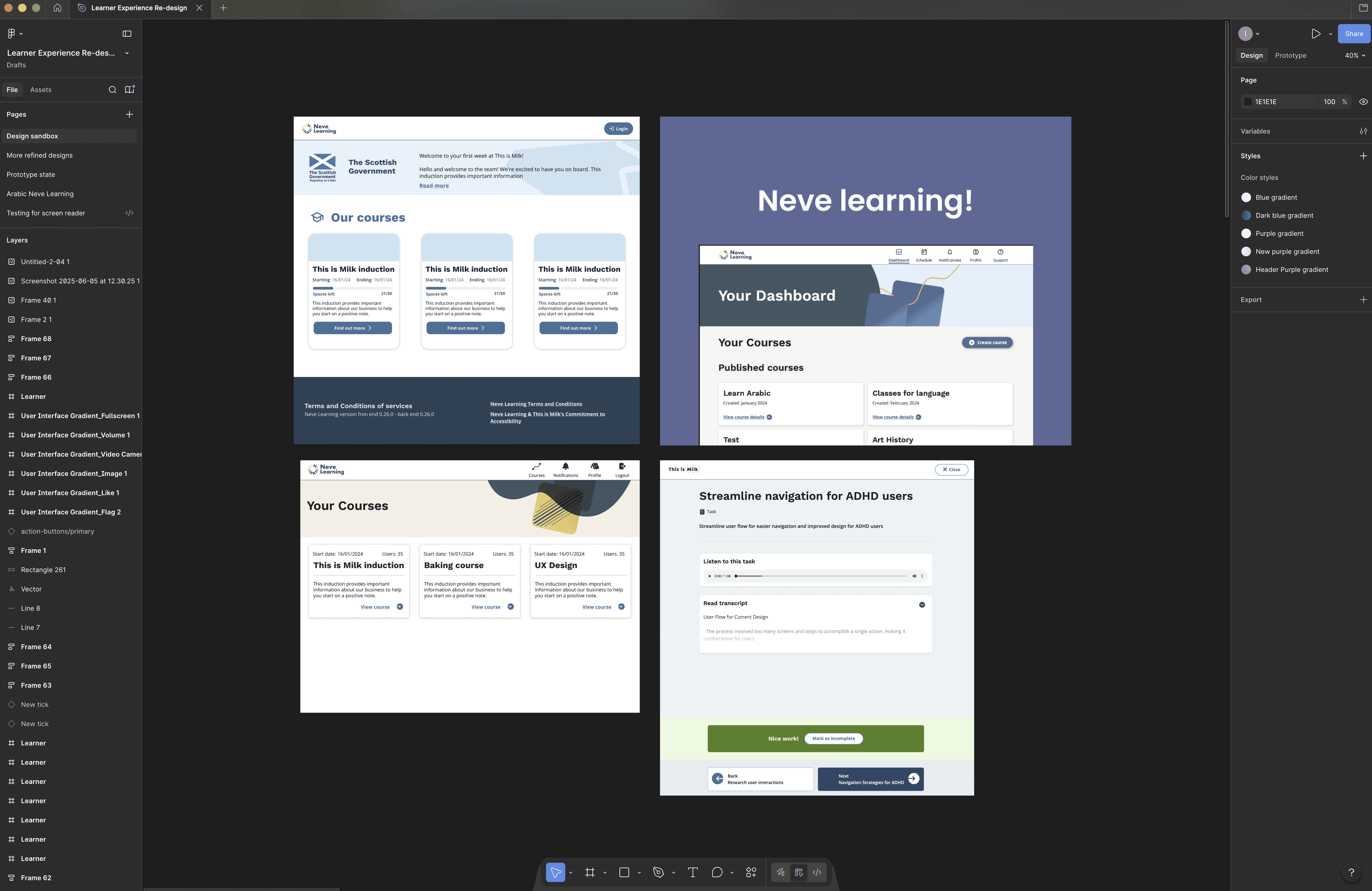
Activity tabs
We introduced a linear tab system that gave learners a clear view of all course activities, their current status, and how many remained. Users could also switch between modules without leaving the immersive learning experience.
Applied branding
Alongside the new learner experience, we took the opportunity to refresh the platform's visual identity. A redesigned header banner was introduced across all screens, creating a consistent and cohesive brand presence throughout.

Feedback and results
The redesign focused on improving clarity and ease of use, helping learners better understand their journey and feel more confident navigating the platform.
"It feels much more cleaner and easy to follow" - User
Increased user engagement and overall satisfaction across the platform. Users gave feedback on the new navigation of activities and felt the refresh look was nicer
Platform adoption within Scottish Government
The redesign helped secure government subscription of the platform and now being used by civil servants across Scotland
“It feels and looks more refreshing than what it was before, I feel more in control of it all” User
